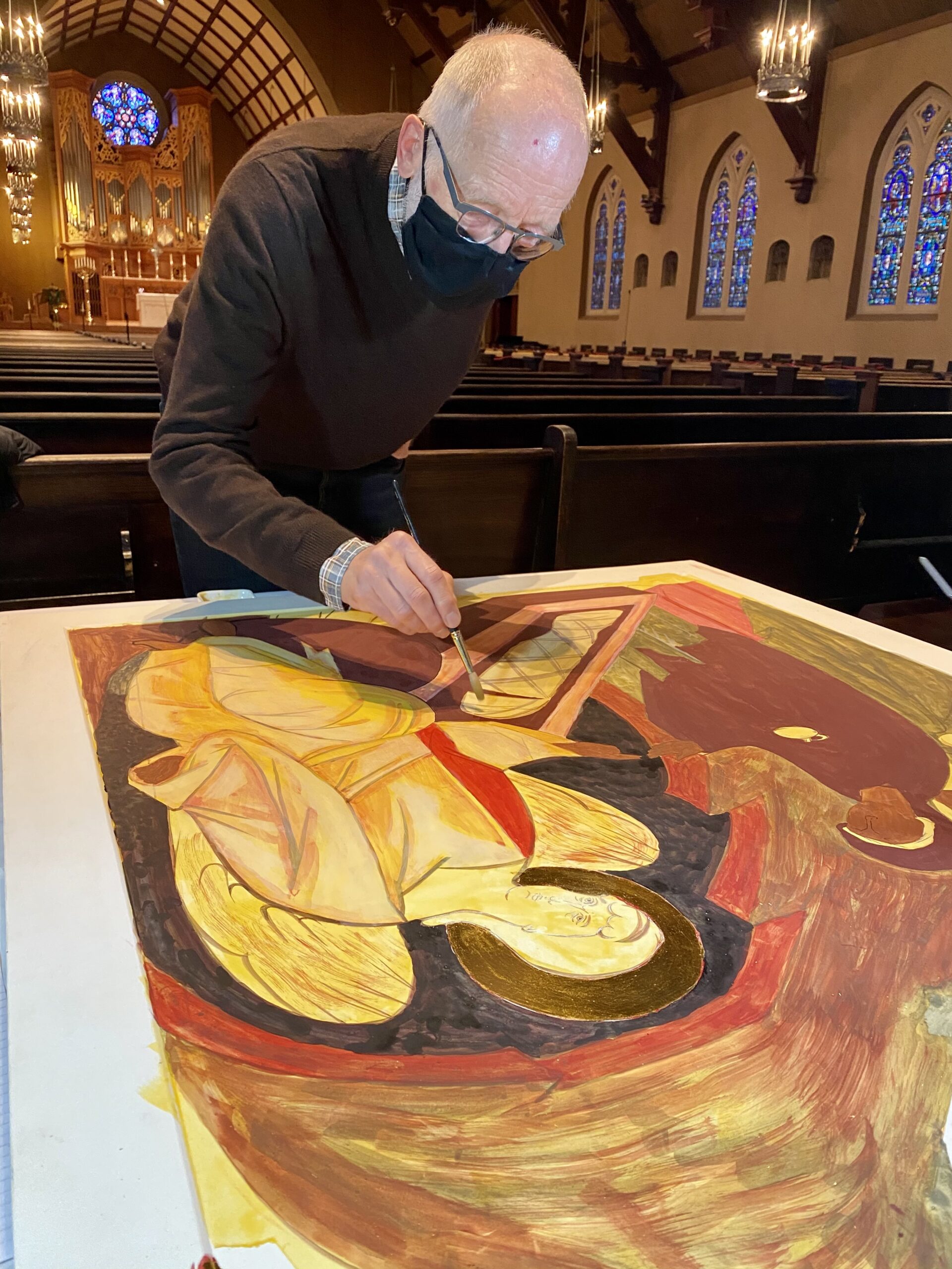
This week, we applied quite a lot of pigment to the entire board, which necessitated a rest on two of our three work days to allow it to dry properly. An icon may have anywhere from 30-40 layers of transparent washes, so proper drying time is essential to avoid pigment lifting. We are still in the very beginning stages and plan to finish in January 2021.
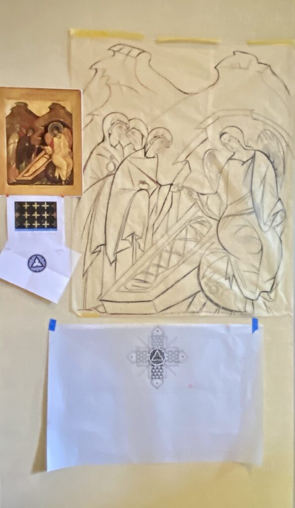
This week, Dennis Sellon designed a beautiful and thoughtful reverse side of the icon. You can see his drafting on our project panel at the Cathedral if you’re on pilgrammage.
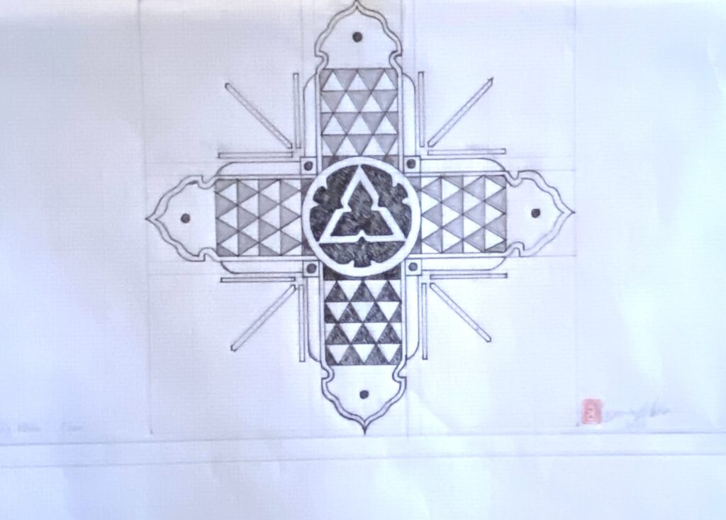
This Japanese style cross, in honor of Bishop elect Dr. Diana Akiyama’s heritage, was inspired by the gilded decoration on a lacquered ceiling in a Japanese palace. The center motif of the original was the chrysanthemum emblem of the Imperial Japanese family, here replaced with the logo of Trinity Episcopal Cathedral. The triangle pattern in the arms of the cross, while used as a symbol of the Trinity, is also a traditional Japanese design called “uroko†(é±—) or scales, which can represent the scales of a fish or a powerful serpent or dragon kami. Kami are the nature spirits of the Japanese Shinto religion. In traditional Japanese theater, a character who transforms into a serpent or dragon kami is dressed in clothing with this pattern. Japanese samurai often wore clothing in this pattern as a talisman to protect them against harm. (Thank you for this description, Dennis.)