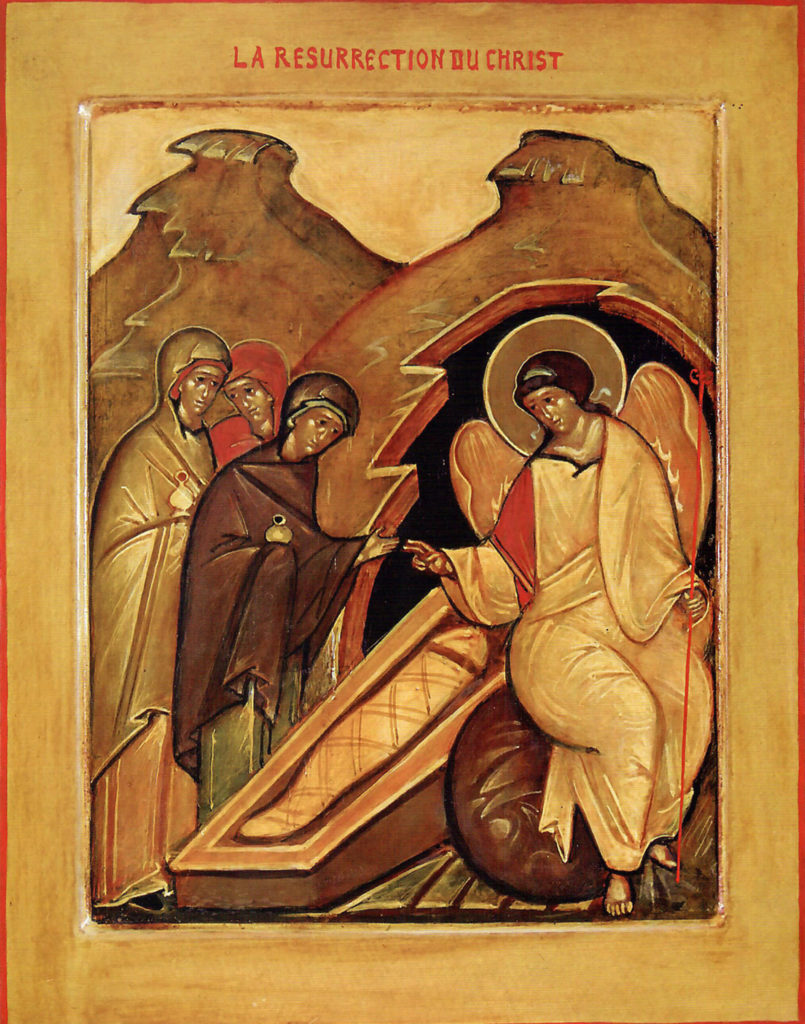
Trinity Iconography Institute has been commissioned by the Vestry of Trinity Episcopal Cathedral, to write an icon in honor of Rev. Diana Akiyama’s consecration as 11th Bishop of the Diocese of Oregon. The icon to be written is “The Myrrh Bearing Women.”

Icon Name: The Myrrh Bearing Women
Icon Prototype: by Leonid Ouspensky
Size: 40†wide x 48†tall with 2.5†raised panel border
Materials: Vegetable: Solid birchwood
Animal: Gesso & Egg Emulsion
Mineral: 23.75 karat patent gold leaf
Medium: Traditional egg tempera on wooden panel
Intention:
While there are other expressions of the Resurrection in Iconography, this specific theme reveals that the Resurrection was first announced to women, who have been underrepresented throughout history. We plan to follow the tradition of depicting these women as they were historically, women of color. This stays true to the Gospel, the Ouspensky prototype, and offers Trinity an opportunity to share this most important message of Christendom in a way that speaks to modern times.
Materials:
An icon is made using Earth’s humble ingredients derived from animals, vegetables and minerals.
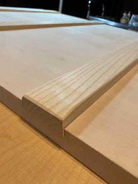
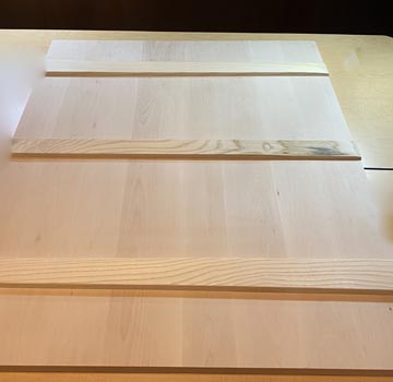
Hand Crafted Wood Icon Panel (Vegetable)
Icons are traditionally painted on wooden panels. The board we ordered for the Myrrh Bearing Women Icon is custom made in Europe from solid birch wood. The board is crafted with “feathers†and is professionally gessoed. Icon boards are made from low resin wood to reduce the potential for warping. To account for the eventual warping over many years’ time, the icon board maker adds “feathers†on the back, which are several graduated inserts of wood placed opposite each other, slightly extended beyond the panel. Over time, should the panel begin to show signs of warping, the feathers are gently tapped in closer to the center of the panel to the keep the board straight.


Professionally Gessoed (Animal & Vegetable)
The icon board’s surface is prepared to accept pigment with the traditional gesso formula of marble dust and rabbit skin glue to provide a luminous surface for application of egg tempera pigment. The gesso is applied in many layers, sometimes up to 20, and is then sanded to a smooth, almost mirror-like, marble finish. The smoother the board, the more flawlessly the gold can be applied. Egg tempera pigment is applied in so many thin washes, possibly 30-40 layers. Gesso functions as a mirror that enables light to shine through the multitude of pigment layers to be reflected back to the viewer.
Traditional Egg Tempera Natural Pigments (Animal, Vegetable, Mineral)
The very first icons were written in the encaustic method which involves suspending pigment in heated beeswax. Later, hot beeswax was replaced with egg emulsion to bind the natural pigments in a method we call “egg tempera.†In this medium, the binding agent for the natural pigments is freshly made egg emulsion from egg yolk, red wine vinegar and water. The egg emulsion we use is made fresh weekly from farm eggs and binds pigments dervied from ground minerals, precious stones and humble Earth.
Our pigments are purchased from Zecchi in Florence, Italy, where a pigment shop has been in the same location since the time of Giotto at the beginning of the Renaissance (1300s). The Uffizi also purchases pigments from Zecchi for conservation of the world’s masterpieces. These pigments are true to those described in the seminal work for artists by Cennino d’Andrea Cennini, “The Craftsman’s Handbook†written in the 15th century in Florence.
Pigments used in Leonid Ouspensky’s prototype icon rely on many beautiful earth tones, which are created with natural earth, or ochre. This icon will have the “salt of the Earth†in it literally.
As stated above, egg tempera pigments are applied in thin, transparent layers that allow light to shine through, which creates a luminous, glowing effect. An icon may have 30 or 40 layers of pigment.
Gold (Mineral)
We are applying 23.75 karat Italian double gold leaf from Zecchi’s in Florence, Italy, to be used in gilding this icon. Florentine gold is considered one of the very finest worldwide. Gold is highly symbolic in iconography as it is attributed to the celestial realm, “the light of the world†– our Lord. Gold was most likely chosen to represent the transcendent world because it was considered the purest element in the world with the ability to retain brightness — a metaphor for the luminous presence in an icon. Its contrast to paint against darkness creates a silhouette of the Holy figure, and recreates the experience of ancient lighting in a dark church.
The precious 23.75 karat double gold transfer leaf we purchased is 120 times thinner than a single human hair (0.5 microns vs. human hair = 60 microns). Transfer gold leaf is lightly adherent to tissue paper with egg white. We purchase this gold from Zecchi’s in Florence, as Italy is well known for quality gold. Extreme care needs to be taken to apply this gold gently so that it will not fold on itself, making sure the workspace is free of air movement. Before covid, we often hold our breath while applying each sheet of gold. (Now the masks make it easier!) After applying gold to the icon panel, we’ll lightly burnish and seal it with gommalacca, a natural insect exudate referred to as shellac. We use “Lemon Shellac Flakes†reconstituted in 91% alcohol. This process protects the gold while we work on painting the icon panel.
Steps
Before we begin each work session, we say prayers to help guide our hands, hearts and minds.
Preparation
Before anything is drawn onto the icon panel, the iconographer analyzes the prototype icon and calculates the geometry of the panel and the design. The underlying geometry creates harmony in proportion and composition so that the icon fulfills its objective to be a prayerful, liturgical aid.
Geometry
Geometry was part of the original Quadrivium curriculum in the medieval university that involved the mathematical arts of arithmetic, geometry, astronomy and music. It was an essential subject for designing Cathedrals, buildings, structuring cities and creating artwork for the ultimate goal of balance and harmony. The connection between balance, harmony and geometry can be traced to Pythagoras and his discovery of harmonious musical intervals, the half, the fifth, the fourth, the three quarter — all of which are important ratios in building, painting and in Christian sacred numerology. The eye finds the golden ratio more pleasing, and over the centuries it became known by many names such as the Proportio divina, the divine section, golden proportion, golden cut, and golden number. While today it is often renamed as “Sacred Geometry,†it refers to geometry that pleases our eye and makes it possible for us to be peaceful in front of an icon when it is well proportioned, composed, and drawn.
Sketching
After the geometry was calculated and drawn on tracing paper, the image was sketched within the geometric guidelines. Once the figures were established and the preparatory drawing was completed, the image was transferred to vellum and then transferred to the gessoed wood icon panel. After the drawing was transferred, we “lined†the icon with the traditional pigment color composed of ivory black and vermillion.
Painting
During the first week, we applied a foundational wash of yellow ochre over the entire board as a unifying wash. Foundational colors were applied to the mountains, the tomb, the angel and the garments.
The areas to be gilded were painted with red, to help cast a rosy glow to the gilding.
Progress updates will be posted regularly.
Gilding
Areas to be gilded are isolated from sections to be painted by application of a special tape to sequester these two sections. We use scalpels to carefully cut around the taped figures that will be painted to protect them from the medium that adheres gold to the panel. On this icon, we will gild the sky, so the painted mountains were separated from the gilded sky.
Once this step is completed, we apply “size†to cover all the areas intended for gold. Size is the medium that enables gold to adhere to the gessoed board. Gold is carefully applied and then treated with gommalacca (shellac) to protect it from scratches while we work on the icon.
Follow Our Progress
We are working near the Lamentation in Trinity Episcopal Cathedral to enable you to watch our progress in bringing this icon to life. Our updates will be posted to Trinity Iconography Institute’s Facebook page, as well as on Trinityiconographers.org. Find the progress description under the heading ICON UPDATES in red bar at the top of website.
If you are in the Cathedral, use your phone to capture the QR code on our bulletin board to take you to the progress updates.
This icon offers the opportunity to share the joy and hope of the resurrection and life everlasting in the context of today’s clear call for diversity and inclusiveness. We believe The Myrrh Bearing Women will create lasting beauty, and inspire hope, spiritually and socially.